Introduction
Choosing paint sounds simple—until you’re standing in front of hundreds of nearly identical color swatches wondering why every shade suddenly looks wrong. Learning how to choose a paint color is one of the most important decisions in home design because color influences mood, lighting, comfort, and the overall personality of a space.
A paint color can completely transform how a room feels. The right shade can make small rooms feel open, dark rooms feel brighter, and ordinary spaces feel warm, elegant, or calming. The wrong choice, however, can make even beautiful furniture and décor feel disconnected.
What makes paint selection difficult is that color changes constantly depending on lighting, undertones, furniture, flooring, and even the time of day. A shade that looks perfect in the store may appear completely different once it’s on your walls.
The good news is that choosing the right paint color doesn’t have to feel overwhelming. Once you understand lighting, undertones, finishes, and color flow, the process becomes much easier and far more enjoyable.
Why Paint Color Matters So Much
Color affects emotions, perception, and atmosphere more than most people realize.
The right paint color can:
- Make rooms feel larger
- Improve natural light
- Create warmth and comfort
- Increase relaxation
- Add sophistication
- Improve design cohesion
Paint also sets the foundation for everything else in a room, including:
- Furniture
- Flooring
- Artwork
- Lighting
- Textiles
- Decorative accents
Because walls occupy so much visual space, even subtle color changes dramatically impact the entire environment.
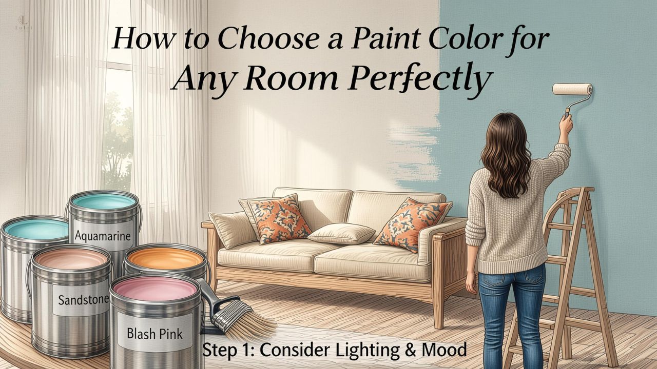
how to choose a paint color Based on Lighting
Lighting is one of the biggest factors influencing how paint appears.
Natural Light Changes Everything
Natural sunlight shifts throughout the day, affecting paint tones constantly.
Rooms facing:
- North often feel cooler and darker
- South receive warmer, brighter light
- East get soft morning light
- West receive warm afternoon light
A beige paint may appear creamy in one room and gray in another depending on sunlight exposure.
Artificial Lighting Matters Too
Light bulbs influence paint undertones significantly.
Common lighting types include:
- Warm white
- Cool white
- Daylight LEDs
- Soft yellow lighting
Always test paint under the actual lighting conditions used in the room.
Test Colors Throughout the Day
A paint color that looks perfect in the morning may feel entirely different at night.
Observe samples:
- Morning
- Afternoon
- Evening
- Artificial lighting only
This prevents costly mistakes later.
Understanding Paint Undertones
Undertones are subtle hidden colors beneath the main shade.
Warm Undertones
Warm colors often contain hints of:
- Yellow
- Red
- Orange
These tones create cozy, inviting spaces.
Warm neutrals work especially well in:
- Living rooms
- Dining rooms
- Bedrooms
Cool Undertones
Cool shades contain hints of:
- Blue
- Green
- Violet
These colors feel calm, crisp, and refreshing.
Cool tones often work beautifully in:
- Bathrooms
- Modern interiors
- Minimalist spaces
Neutral Paint Isn’t Truly Neutral
Even whites and grays usually lean warm or cool.
This explains why two “white” paints can look dramatically different side by side.
Choosing Paint Colors for Different Rooms
Every room serves a different purpose, so color selection should support how the space feels and functions.
Living Room Paint Ideas
Living rooms often benefit from:
- Warm neutrals
- Soft earth tones
- Greige shades
- Muted greens
These colors create comfort and flexibility for decorating.
Bedroom Paint Colors
Bedrooms should encourage relaxation.
Popular bedroom tones include:
- Soft blues
- Sage green
- Warm taupe
- Dusty rose
- Creamy whites
Calming colors help create restful environments.
Kitchen Paint Colors
Kitchens often work well with:
- Crisp whites
- Warm beige
- Olive green
- Soft gray
- Navy accents
The right kitchen color balances cleanliness with warmth.
Bathroom Paint Colors
Bathrooms benefit from fresh, calming shades.
Popular choices include:
- Pale blue
- Soft gray
- Sand tones
- White
- Light green
Reflective surfaces also influence how bathroom paint appears.
how to choose a paint color That Matches Existing Décor
Paint should complement permanent elements already in the home.
Consider Flooring First
Flooring strongly influences paint compatibility.
Pay attention to:
- Wood undertones
- Tile colors
- Carpet shades
- Stone finishes
Warm floors usually pair better with warm paint tones.
Coordinate With Furniture
Large furniture pieces affect overall color balance.
Look at:
- Sofa fabrics
- Wood finishes
- Cabinet colors
- Curtains
- Rugs
Paint should support—not compete with—existing décor.
Use Inspiration Pieces
Many designers begin with one inspiration item such as:
- Artwork
- Pillows
- Rugs
- Fabric patterns
Pulling paint colors from existing pieces creates natural cohesion.
Popular Paint Color Families
White Paint Colors
White remains timeless but surprisingly complex.
Popular white categories include:
- Warm white
- Bright white
- Cream white
- Soft white
Warm whites generally feel more inviting in homes.
Gray Paint Colors
Gray continues evolving beyond cool industrial tones.
Modern grays often include:
- Greige blends
- Warm taupe undertones
- Soft charcoal accents
These shades feel more livable and balanced.
Earthy Tones
Earth-inspired colors are increasingly popular.
Examples include:
- Clay
- Terracotta
- Olive green
- Sand
- Mushroom
These colors create grounded, calming interiors.
Paint Finishes and Sheens Explained
Color matters, but finish affects both appearance and durability.
Matte and Flat Finishes
Flat paints absorb light and hide wall imperfections well.
Best for:
- Bedrooms
- Ceilings
- Low-traffic areas
However, they can be harder to clean.
Eggshell and Satin Finishes
These finishes provide slight softness and durability.
Ideal for:
- Living rooms
- Hallways
- Dining spaces
They balance appearance and practicality effectively.
Semi-Gloss and Gloss Finishes
Glossier finishes reflect more light and resist moisture.
Best used for:
- Trim
- Cabinets
- Bathrooms
- Kitchens
Too much gloss on walls can highlight imperfections.
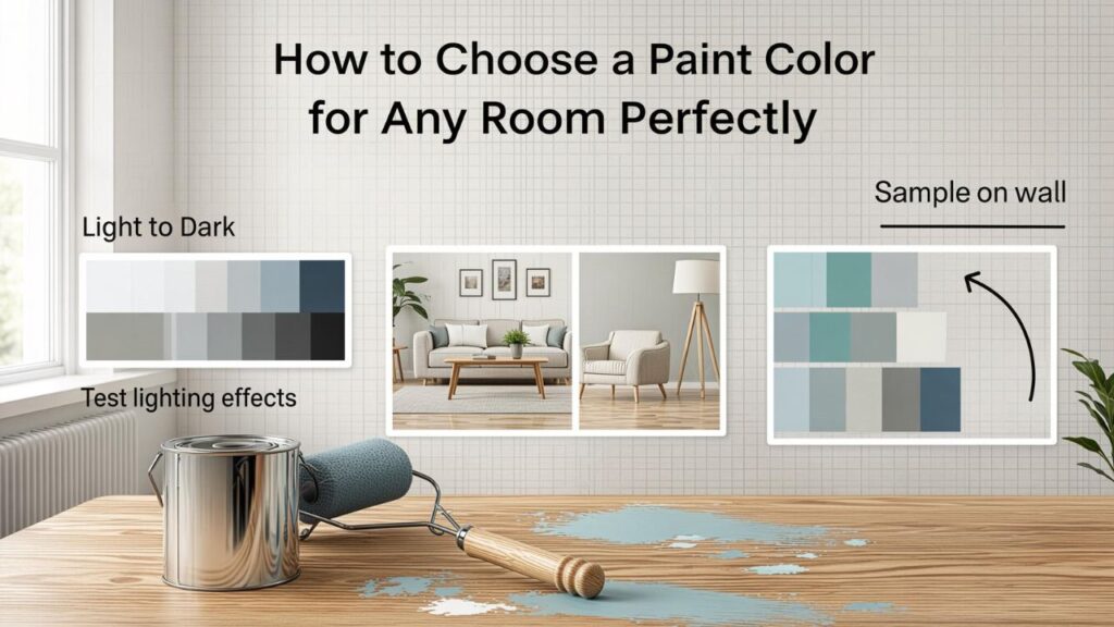
Testing Paint Samples Properly
Skipping sample testing is one of the biggest paint mistakes homeowners make.
Paint Large Swatches
Tiny paint chips rarely reveal true color behavior.
Instead:
- Paint large sections
- Use poster boards if needed
- Move samples around the room
Larger tests provide more accurate results.
Test Multiple Shades
Even colors that seem identical can appear very different once painted.
Try:
- Lighter options
- Darker versions
- Warm and cool variations
Comparisons make decisions easier.
Avoid Choosing Paint in the Store Alone
Store lighting is highly misleading.
Always test colors in your actual home before committing.
Common Paint Color Mistakes to Avoid
Ignoring Undertones
Undertones can clash with furniture, flooring, or lighting if overlooked.
Choosing Colors Too Quickly
Paint decisions deserve patience.
Testing and observing samples prevents expensive repainting later.
Following Trends Blindly
Trendy colors may not suit your home’s lighting or style.
Focus on colors you genuinely enjoy living with long-term.
Creating Flow Between Rooms
Paint colors should feel connected throughout the home.
Use Coordinating Tones
Adjacent rooms don’t need identical colors, but they should feel harmonious.
Choose shades with:
- Similar undertones
- Complementary warmth
- Coordinated depth
Repeat Accent Colors
Repeating accent tones throughout the home creates visual continuity.
Consider Open Floor Plans
Open layouts benefit from smoother color transitions to avoid visual disruption.
Small Room Paint Tips
Paint can dramatically affect perceived space.
Light Colors Expand Rooms
Soft colors reflect more light and create openness.
Dark Colors Add Depth
Dark shades can actually make small rooms feel cozy and sophisticated when used thoughtfully.
Use Monochromatic Schemes
Similar shades reduce visual breaks and create smoother spatial flow.
Ceiling and Trim Color Tips
Walls aren’t the only surfaces influencing room atmosphere.
White Ceilings Remain Popular
White ceilings create height and brightness.
Matching Trim and Walls
Painting trim the same color as walls creates:
- Modern simplicity
- Visual softness
- Cohesion
Contrasting Trim Adds Definition
Traditional interiors often benefit from crisp contrasting trim.
Paint Trends vs Timeless Colors
Timeless Colors
Classic choices include:
- Warm white
- Soft beige
- Greige
- Navy blue
- Sage green
These shades remain versatile for years.
Trending Colors
Current trends include:
- Earthy greens
- Deep browns
- Muted terracotta
- Dusty blues
Trends can add personality when used intentionally.
Emotional Effects of Paint Colors
Color psychology plays a major role in home comfort.
Calm Colors
Soft blues and greens encourage relaxation.
Warm Colors
Earthy tones create warmth and intimacy.
Bright Colors
Bold shades energize spaces but work best in moderation.
how to choose a paint color for Resale Value
If resale matters, neutral palettes generally appeal to more buyers.
Popular resale-friendly colors include:
- Warm white
- Soft gray
- Beige
- Light greige
Neutral homes feel:
- Cleaner
- Larger
- More adaptable
However, subtle personality still matters.
FAQ
Frequently Asked Questions
What is the best way to choose a paint color?
Start by considering lighting, room purpose, existing décor, and undertones before testing samples in the actual space.
Why does paint look different on walls?
Lighting, undertones, room size, and surrounding furniture all affect how paint appears once applied.
Should I test paint before buying gallons?
Absolutely. Large test swatches help prevent expensive mistakes and reveal how colors change throughout the day.
What paint colors make rooms look bigger?
Light neutrals, soft whites, pale grays, and muted cool tones generally create a more open feeling.
How do I identify paint undertones?
Compare colors side by side with true whites or similar shades to reveal hidden warm or cool tones.
Are dark paint colors bad for small rooms?
Not necessarily. Dark colors can create cozy, dramatic spaces when balanced with proper lighting.
What finish is best for walls?
Eggshell and satin finishes are popular because they balance durability with soft appearance.
Should every room in a house be the same color?
No, but colors should feel connected through complementary undertones or coordinated palettes.
What is the safest neutral paint color?
Warm whites and soft greige shades tend to work well in many lighting conditions and decorating styles.
How long should I observe paint samples?
Ideally, observe samples for at least 24–48 hours under both natural and artificial lighting.
Conclusion
Choosing paint can feel overwhelming at first, but understanding lighting, undertones, finishes, and room function makes the process far more manageable. Once you know how to choose a paint color thoughtfully, your home begins to feel more cohesive, comfortable, and visually balanced.
The best paint colors aren’t necessarily the trendiest ones—they’re the shades that work beautifully with your lighting, support your lifestyle, and create the atmosphere you want to experience every day. Whether you prefer warm neutrals, calming greens, dramatic dark tones, or timeless whites, the right paint choice has the power to completely transform how your home feels.