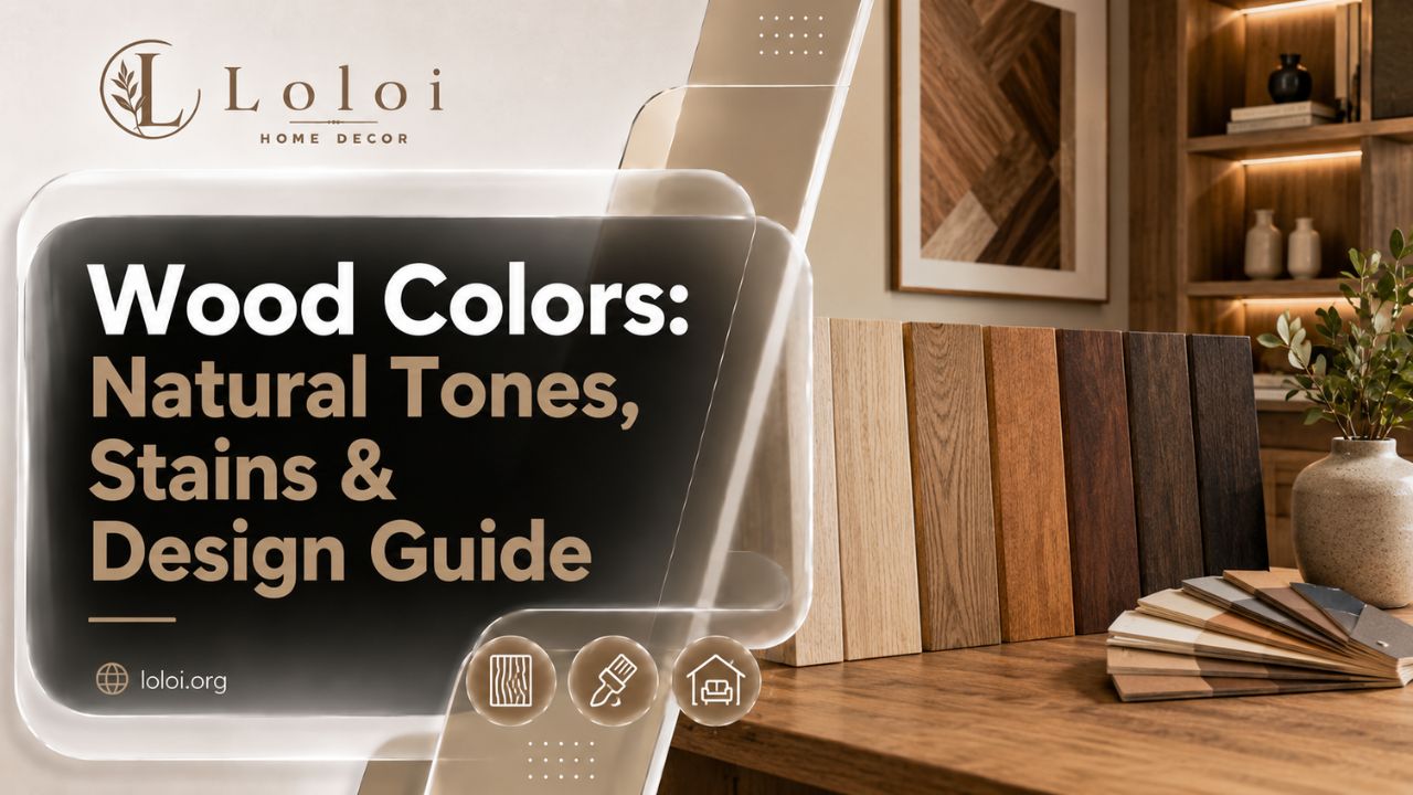
Stand in a lumber yard for five minutes and you’ll hear the same word used three different ways. Someone asks for “that reddish wood,” someone else wants to match a stain they saw on Pinterest, and a third person is holding a floor sample trying to figure out if it’s oak or something else entirely. All three are talking about “wood color,” and all three need a slightly different answer.
That overlap is exactly why most wood color guides end up frustrating to read. They either list species names with a color adjective next to each one, or they show a wall of stain swatches with no explanation of what’s actually happening underneath the finish. Neither approach helps you make a decision you’ll still be happy with in two years.
This guide takes a different approach. Instead of a flat list, you’ll get the framework professionals actually use — understanding undertone — plus the real species colors, the real stain names, how those colors shift over time, and how to handle the situation almost everyone eventually runs into: matching a new piece of wood to one you already own.
What “Wood Color” Actually Means (Natural Tone vs. Stain)
Before comparing shades, it helps to separate two things that get talked about as if they’re the same: the wood’s natural color, and a stain color applied on top of it.
Natural wood color is the hue of the species itself, straight from the tree. Walnut is naturally a deep chocolate brown. Maple is pale and creamy. Cherry starts light and darkens into a warm reddish-brown on its own, without any stain at all. This natural color comes from the tree’s pigments, resin content, and mineral makeup, and it’s the reason two unstained boards — say, oak and walnut — can look completely different sitting side by side with nothing but a clear topcoat on either one.
Stain color, on the other hand, is a manufactured product with its own name — “Jacobean,” “Golden Oak,” “Special Walnut” — designed to shift a wood’s appearance toward a target look. Here’s the part that trips people up: the exact same stain color looks noticeably different depending on which species it’s applied to, because the wood’s own natural tone and grain openness change how the pigment sits and how much of it soaks in. A “Golden Oak” stain on actual oak reads differently than the same stain on maple or pine, because the underlying wood is contributing its own color underneath the stain the whole time.
That’s the single most useful thing to internalize before going further: you are never really choosing a stain color in isolation. You’re choosing a stain color on a specific species, and the species is doing at least half the work.
The Undertone Framework: Warm, Cool, and Neutral Wood
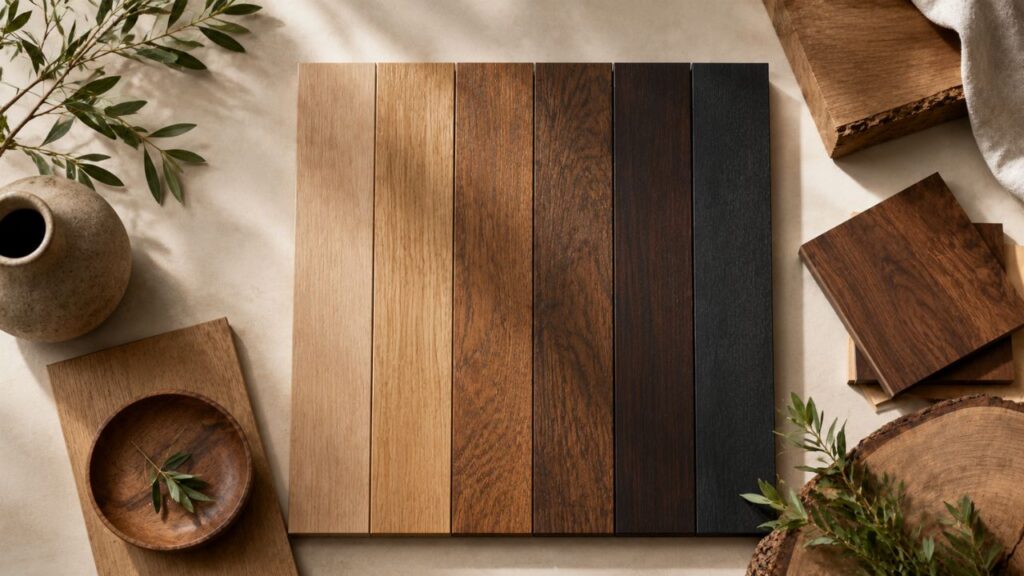
If there’s one skill that separates someone who can confidently match wood tones from someone who’s guessing, it’s reading undertone. Undertone is the subtle secondary hue running underneath a wood’s main color — the difference between a brown that leans yellow, a brown that leans pink or red, and a brown that leans gray or neutral.
Most natural wood falls into one of three undertone families:
- Warm-yellow to warm-orange undertones — oak, pine, birch, and butternut generally sit here. These woods can look golden, honey-toned, or even slightly orange under certain lighting, especially incandescent bulbs, which push warmth even further.
- Warm-red to pink undertones — cherry, mahogany, and some alder fall into this group. These woods often look neutral-brown in photos but reveal a rosy or reddish cast in direct sunlight, which is why cherry furniture can suddenly look “too pink” next to a cooler-toned wall color.
- Neutral to cool-gray undertones — white oak, ash, and gray-washed or weathered finishes lean here. These are the easiest tones to pair with a wide range of colors because they don’t fight with either warm or cool palettes.
Here’s why this matters more than species name alone: two different species with the same undertone family will usually coordinate better than two pieces of the same species with different finishes. A warm honey-oak floor and a warm-toned walnut console can work together beautifully, while that same oak floor next to a cool gray-washed oak cabinet can look mismatched — even though it’s technically “the same wood.”
The quickest way to test undertone at home is old-fashioned but effective: look at the wood in direct daylight, not under artificial light, and squint slightly. Squinting reduces your eye’s sensitivity to fine detail and grain, letting the underlying color family come through more clearly.
Natural Wood Colors by Species
Here’s how the most commonly used woods actually look before any stain is involved. Keep in mind that natural variation is real — even boards from the same tree can differ, and color deepens with age and light exposure.
- White Oak — light tan to golden brown, with the most neutral undertone of the common oaks; tends to warm slightly over years of exposure.
- Red Oak — similar tan base to white oak but with a noticeably pinker cast, especially visible in raw or lightly finished boards.
- Maple — pale, almost creamy white to light tan; one of the lightest common hardwoods, which is also why it’s prone to blotchy stain absorption.
- Cherry — starts as a light pinkish-tan and darkens dramatically over months of light exposure into a rich, warm reddish-brown — one of the few woods where “natural aging” is part of the intended look.
- Walnut — deep chocolate brown, sometimes with a faint purplish cast in fresh-cut boards, generally left unstained because it’s difficult to improve on.
- Mahogany — reddish-brown with a fine, straight grain; often deepens toward a darker red-brown with age and UV exposure.
- Pine — pale yellow to light honey, soft and porous, which makes it absorb stain unevenly without a conditioner first.
- Cedar — warm amber-red, prized for outdoor use partly because its natural oils resist rot as well as look good.
- Ash — light, almost blonde, with a pronounced open grain and a slightly grayer cast than maple.
- Hickory — high color variation within a single board, ranging from near-white sapwood to reddish-brown heartwood, which gives hickory its rustic, high-contrast look.
- Teak — golden to medium brown with a slightly oily surface sheen; darkens toward a silvery gray outdoors if left unsealed.
- Ebony — one of the few naturally near-black woods, dense and used sparingly because of cost and rarity.
Common Stain Colors and What They’re Actually Called
If you’ve ever stood in a flooring showroom trying to remember the name of a color you liked, this is the vocabulary that comes up again and again across major stain lines:
- Natural / Clear — protects the wood while barely shifting its own color.
- Golden Oak / Honey — warm amber, popular for keeping a room feeling light and traditional.
- Special Walnut / Provincial — a medium warm brown, one of the most common “safe middle ground” choices.
- Early American / Chestnut — a slightly deeper reddish-brown, common in traditional furniture.
- Jacobean — a dark, almost charcoal-brown with cool undertones; one of the most popular dark floor stains of the past decade.
- Espresso / Ebony — very dark, near-black, high-contrast against lighter walls and trim.
- Gray Wash / Weathered Gray — a modern, cooler-toned finish that mutes the wood’s natural warmth rather than replacing it entirely.
- Whitewash — a translucent white finish that lets grain show through while brightening the overall tone.
The practical takeaway: stain names aren’t standardized across brands, so “Jacobean” from one manufacturer and “Dark Walnut” from another can land in nearly the same place. What matters more than memorizing names is understanding the category — light warm, medium warm, dark warm, or cool-gray — and asking to see that category applied to the actual species you’re using, not just a chip on a card.
How Wood Color Changes Over Time
Wood is not a static material, and this is where a lot of buyer’s remorse comes from — someone chooses a color, loves it for a year, and then feels like it’s “changed” on them. In most cases, it has, and there’s a real reason.
UV exposure and oxidation cause most of the shift. Sunlight breaks down surface fibers and reacts with natural compounds in the wood, which is why cherry deepens into a richer red-brown over its first year of daily light exposure, and why pine and fir can yellow noticeably where furniture or rugs haven’t blocked the light — leaving a visible “shadow” of the original color underneath.
Tannin reactions matter especially for oak and other tannin-rich species. Certain finishes, as well as contact with iron (including some water-based products and even steel wool used during finishing), can trigger a chemical reaction that darkens or grays the wood — sometimes intentionally, as with modern gray-wash oak floors, and sometimes as an unwanted surprise.
Finish type affects the trajectory. Oil-based finishes tend to amber and warm up over years, which can shift a “neutral” stain gradually toward yellow or orange. Water-based finishes stay closer to their original color longer but can feel visually flatter or cooler by comparison.
None of this means wood color is unpredictable — it means it’s directional. Warm woods generally get warmer with light exposure; that’s useful information when you’re choosing a color you’ll be looking at for a decade, not just for the first six months after installation.
How to Identify a Wood Color You Don’t Know the Species Of
This is the scenario almost every existing guide skips, and it’s arguably the most common real-world reason people search “wood colors” in the first place: you’ve inherited furniture, bought a house with existing floors, or found a great piece secondhand, and you have no idea what wood it is or what undertone family it belongs to.
A practical approach:
- Look at an unfinished or hidden edge — the underside of a drawer, the back of a cabinet, or a spot the finish has worn thin. This shows you closer to the wood’s true color, without decades of finish buildup skewing your read.
- Check the grain pattern, not just the color. Tight, fine, relatively straight grain suggests maple, cherry, or birch. Open, pronounced grain with visible pores suggests oak or ash. Wild, high-contrast grain suggests hickory.
- Test undertone in daylight, using the squint method described earlier, away from any artificial lighting that might be adding warmth or coolness.
- Bring a sample if possible. A cut-off, a drawer, or even a clear photo taken in natural light lets a flooring or furniture specialist give you a far more accurate match than a description alone — color memory is notoriously unreliable, and most mismatches happen because someone matched from memory instead of a physical or photographed reference.
You don’t need to identify the exact species to make a good decision. You mainly need the undertone family — that’s what determines whether a new piece will look intentional next to the old one, or slightly “off” in a way that’s hard to pin down.
Matching and Mixing Wood Tones in the Same Room
The instinct to make every wood surface in a room match exactly is understandable, but it’s not actually necessary, and chasing a perfect match often ends up looking more artificial than an intentional mix.
A few practical guidelines that hold up in real rooms:
- Match undertone before matching exact shade. A honey-oak floor and a medium-brown walnut table can coordinate well because both lean warm, even though they’re not the same color.
- Vary the value, not just the hue. If your floor and your cabinetry are both medium-brown, the room can start to feel flat. Introducing a lighter or darker wood tone elsewhere — a dining table, open shelving, a piece of trim — adds depth instead of competing.
- Let one wood tone lead. In rooms with multiple wood elements, pick the largest surface (usually the floor) as the anchor undertone, and treat everything else as either complementary (same undertone family) or intentional contrast (a deliberately different tone, used sparingly).
- Watch for the “almost but not quite” mismatch. Two warm woods that are close but not aligned — say, an orange-leaning oak next to a red-leaning cherry — often look worse together than two woods that are clearly, intentionally different. If a pairing feels slightly off, it’s often because the undertones are close enough to invite comparison but not close enough to agree.
Wood Colors by Application (Floors, Cabinets, Furniture, Decks)
The same color can behave differently depending on where it’s used, mostly because of light angle, wear patterns, and finish type.
- Flooring takes the most ambient light and the most wear, so color reads more intensely across a large horizontal surface than it does on a small sample. Darker floor stains also show dust and scratches more visibly than medium tones.
- Cabinetry is viewed vertically and often under task lighting, which can make warm stains look more saturated than they do on a horizontal sample board — worth testing cabinet stain samples at eye level, under your kitchen’s actual lighting, before committing.
- Furniture benefits from richer, deeper colors since it’s typically a smaller surface area and often the visual focal point of a room, where the extra depth reads as intentional rather than overwhelming.
- Decking and exterior wood need to account for UV and weather from the start. Semi-transparent stains let the grain show while offering real protection, but darker exterior stains fade faster and need more frequent reapplication than lighter ones, since dark pigments absorb more UV energy.
Wood Colors That Are Trending — and Which Are Timeless
Trend cycles in wood tones move slower than paint trends, but they do move. Recent interior design coverage has pointed toward a shift away from the very dark, cool-gray floors that dominated the last decade, back toward warmer, more natural mid-tones — honey oak, warm walnut, and finishes that let visible grain show through rather than flattening it out.
That said, a few tones have stayed reliably in demand for decades rather than cycling in and out:
- Natural or lightly-finished white oak — consistently popular because its neutral undertone pairs with almost anything.
- Medium warm walnut tones — read as classic rather than trendy, likely because they mirror the wood’s natural color rather than fighting it.
- Clear or near-clear finishes on naturally colorful woods like cherry and mahogany — these age gracefully because the color develops from the wood itself, not from a stain that can look dated later.
If you’re choosing a wood color for something expensive or hard to change — flooring, kitchen cabinetry — leaning toward these timeless, undertone-neutral options is generally the safer long-term bet over a color that’s peaking in popularity right now.
Frequently Asked Questions
What color is oak wood naturally? Oak ranges from light tan to golden brown. Red oak leans slightly pink, while white oak has a more neutral, balanced undertone that ages toward a warmer gold over time.
How do I match different wood tones in the same room? Match undertone families (warm, cool, or neutral) rather than exact shades, let your largest wood surface set the anchor tone, and vary the lightness/darkness across pieces to add depth instead of flatness.
Does wood color change over time? Yes. UV exposure and oxidation shift most woods warmer and deeper — cherry is the clearest example — while certain finishes and tannin reactions can push oak toward gray or amber over years.
What’s the difference between a wood’s natural color and a stain color? Natural color comes from the species itself. Stain color is a product applied on top, and it always interacts with — rather than replaces — the wood’s own underlying tone.
What wood is reddish-brown? Cherry and mahogany are the most common naturally reddish-brown woods, with cherry deepening noticeably over its first year of light exposure.
What colors go with natural wood furniture? Warm woods generally pair well with warm neutrals, sage greens, and terracotta. Cool or gray-toned wood pairs more easily with whites, cool grays, and blues, since the undertones don’t compete.