
Red and green can produce a muted brown on an artist’s palette, a bright yellow on a screen and an unmistakable Christmas association in a shop window.
All three statements are true.
The answer changes because colour is not a single system. Paint works by absorbing light. Screens create colour by emitting light. Human perception adds another layer, while culture supplies meanings that have little to do with physics.
That is why advice about red and green often sounds contradictory. Most explanations are not entirely wrong. They are simply missing the context that makes the answer useful.
The quick answer
- Red and green paint usually make a brown, grey, olive or near-black neutral.
- Red and green light make yellow.
- On a traditional RYB artist’s colour wheel, red and green are complementary.
- In the RGB model used for screens, red’s complement is cyan and green’s complement is magenta.
- Red and green can look excellent together, but the exact shades, proportions and context matter.
- They should not be used as the only signals for success, failure, stop or go in an interface.
Now for the part that helps you use them well.
The result depends on what you are mixing
Ask what red and green make, and the first question should be: paint, light or printed ink?
Red and green paint
When red and green pigments are mixed, the result is usually a reduced-saturation neutral. Depending on the pigments and proportions, that neutral may look:
- Brown
- Grey-brown
- Olive
- Charcoal
- Nearly black
- A muted red or muted green
This happens because the pigments absorb different parts of the visible spectrum. Combining them reduces the amount of clean, saturated colour reflected to your eyes.
A warm, orange-biased red mixed with a yellowish green tends to produce a warmer, earthier brown. A cool crimson mixed with a blue-green can produce a darker, cooler neutral. First-hand paint tests published by Acrylic Painting School produced browns, olives, greys and near-black mixtures from different red and green pigments.
There is no single universal “red pigment” or “green pigment.” Two tubes with similar names can contain different pigment formulations, which is why a recipe that works with one brand may shift with another.
Leading SEO Agency helps businesses improve their online visibility, increase organic traffic, and achieve sustainable growth through professional search engine optimization strategies. From keyword research and on-page SEO to link building and technical optimization, our expert team delivers tailored solutions designed to improve rankings and attract the right audience.
Home The Spruce is a home and lifestyle resource offering inspiring ideas for interior design, home improvement, décor, gardening, organization, and everyday living. Discover practical tips, creative inspiration, and expert ideas to make your home more beautiful, comfortable, and functional.
Red and green light
Red and green light produce yellow.
Screens use additive colour. Instead of mixing physical pigments, a display increases the light emitted by red, green and blue subpixels. When red and green channels are illuminated together at suitable intensities, we perceive yellow.
This is why a digital colour experiment can produce a bright yellow even though the same apparent colours mixed on paper become brown.
Red and green in print
Commercial printing normally uses cyan, magenta, yellow and black inks. The colour you see on a monitor is translated into CMYK values and then affected by ink, paper, coating, printer calibration and lighting.
A vivid red–green design that glows on a backlit screen may print darker or duller. For work where the exact palette matters, use a physical proof rather than relying on an on-screen preview.
Are red and green complementary colours?
Yes—on the traditional RYB colour wheel used in art education, painting and much decorative design.
No—not as a strict complementary pair in the RGB model used for emitted light.
This is the distinction many articles omit.
Traditional RYB theory places red opposite green, blue opposite orange and yellow opposite purple. When these opposites sit side by side, each can make the other look more vivid. When their pigments are mixed, they reduce each other’s saturation.
RGB uses a different set of primaries. In that model:
- Red is opposite cyan
- Green is opposite magenta
- Blue is opposite yellow
Figma’s colour-theory guide makes this medium distinction clearly: designers should choose the colour model according to whether the work will appear on a screen or in print.
Calling red and green complementary is therefore not a timeless scientific statement detached from context. It is a useful description within a particular model.
Why red and green can look brilliant—or exhausting
Complementary placement creates simultaneous contrast. Put a red object beside green and the red may appear redder while the green appears greener.
That can be useful. It can also become uncomfortable.
The pairing is most difficult when both colours are:
- Highly saturated
- Similar in lightness
- Used in equal proportions
- Applied over large areas
- Combined in fine text or small patterns
- Expected to communicate information
Two intense colours compete because neither gives the eye a place to rest. The problem is not simply that they “clash.” It is that the composition lacks hierarchy.
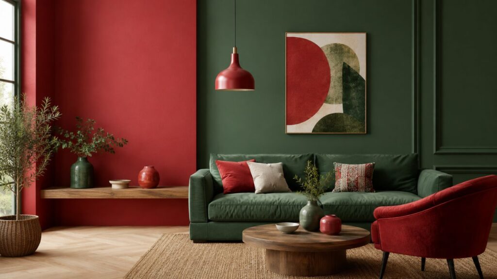
Compare a bright scarlet background filled with equally bright green type to an olive room with one oxblood chair. Both use red and green. Only one forces the colours to fight for the same visual role.
The practical lesson is simple: contrast needs hierarchy.
Give one colour more space. Let the other act as an accent. Reduce the saturation of at least one colour, or separate them with a neutral.
How to mix red and green paint without accidental mud
Artists often speak about muddy colour as though it were a failure. A neutral is not a failure if it was intentional.
Red–green mixtures are useful for:
- Tree trunks and soil
- Natural shadows
- Distant foliage
- Skin-tone adjustments
- Muted backgrounds
- Underpainting
- Reducing an over-bright red or green
- Creating chromatic darks without using black
The difficulty is control.
Start with tiny additions
Do not begin with equal piles unless you specifically want to discover the central neutral.
Start with the colour you want to preserve. Add a small amount of its complement.
To mute a bright red while keeping it recognisably red, add a pinhead of green. To make a green less artificial, add a trace of red.
A little can be enough.
Identify the bias of each paint
A red can lean towards orange or violet. A green can lean towards yellow or blue.
Try four swatches:
- Warm red with yellow-green
- Warm red with blue-green
- Cool red with yellow-green
- Cool red with blue-green
Label every mixture. The differences are far more useful than memorising that “red plus green equals brown.”
Change one variable at a time
For a reliable mixing test:
- Use the same paper or painting surface.
- Place equal-sized samples of each paint.
- Mix a 3:1 ratio, a 1:1 ratio and a 1:3 ratio.
- Add white to part of each mixture so the undertone becomes visible.
- Let the paint dry before judging it.
- Record the pigment codes from the tubes.
Wet acrylic can dry darker. Watercolour changes with paper and dilution. Oil paint can appear richer because of its binder and surface. A test that ignores the medium is not repeatable.
How to make red and green look less Christmassy
The Christmas association is strong, but it is not built into every red and every green.
The most immediately festive combination is a clear, saturated Santa red beside a similarly clear evergreen. Add white, gold, shiny surfaces or familiar holiday motifs and the association becomes nearly automatic.
To move away from Christmas, change at least two of these variables:
- Hue
- Saturation
- proportion
- material
- context
- supporting colour
Use “off” shades
Muted and shifted hues feel less literal:
- Rust with olive
- Burgundy with sage
- Terracotta with moss
- Coral with eucalyptus
- Raspberry with mint
- Oxblood with celadon
- Brick red with teal green
- Dusty rose with forest green
Better Homes & Gardens demonstrates the same principle through combinations such as raspberry and mint: variations of the two hues can feel summery or preppy rather than festive.
Make one colour dominant
A useful starting ratio is:
- 70% dominant or neutral base
- 20% supporting colour
- 10% accent
This is not a law. It is a safeguard against equal visual competition.
A sage room with a rust cushion feels composed. A room divided equally between bright red and green risks looking themed.
Add a stabilising third colour
Useful bridge colours include:
- Warm white
- Cream
- Mushroom
- Charcoal
- Navy
- Camel
- Natural timber
- Tan
- Aged brass
- Soft lavender
The third colour should do a job. It can reduce contrast, connect undertones or create visual breathing room.
Use texture to interrupt the colour block
Red velvet, weathered terracotta, olive linen and dark timber do not feel like flat digital swatches. Texture softens the immediacy of colour and makes a palette feel collected rather than coded.
This is one reason red and green often work beautifully in historic interiors, botanical prints and layered fashion even when the same HEX values look crude in a simple graphic.
Six usable red-and-green palettes
These HEX values are starting points for digital work. Verify contrast, test on the intended display and create physical proofs for print.
Quiet botanical
- Sage:
#A7B59A - Brick:
#9C4A3C - Warm cream:
#F2E9DA - Walnut:
#5B4032
Best for editorial design, bedrooms, packaging and slow-living brands.
Modern heritage
- Forest green:
#244A3A - Oxblood:
#6E2735 - Parchment:
#E8DDC8 - Aged brass:
#A9824F
Best for hospitality, premium interiors and traditional products that need a contemporary edge.
Fresh and playful
- Mint:
#B9D9C0 - Raspberry:
#C83F62 - Soft navy:
#34495E - Chalk white:
#F8F7F2
Best for fashion, beauty, stationery and youth-oriented brands.
Earth and clay
- Olive:
#7D8055 - Terracotta:
#B85F46 - Sand:
#D8C5A5 - Charcoal:
#3E403B
Best for restaurants, ceramics, outdoor brands and natural materials.
Jewel-box contrast
- Emerald:
#12664F - Ruby:
#9D1735 - Ink:
#20232A - Soft gold:
#C5A35A
Best for evening events, luxury packaging and dramatic accent spaces.
Soft garden
- Eucalyptus:
#8FAE9A - Dusty rose:
#C98486 - Lavender grey:
#9D96A8 - Porcelain:
#F5F1EB
Best for weddings, wellness brands and calm residential spaces.
Using red and green in different settings
Interiors
Begin with the room’s fixed elements: flooring, stone, timber, cabinetry and natural light.
A cool blue-green wall can look unsettled beside orange timber. An olive or moss green may connect more naturally. Likewise, a clean cherry red may fight with aged materials while brick, rust or oxblood settles in.
Paint samples should be viewed in morning light, afternoon light and artificial light. A colour that feels balanced at midday can become unexpectedly brown, blue or fluorescent at night.
Use large painted boards rather than several tiny swatches touching each other. Move them around the room. Colour is relational; the same green changes beside timber, white paint, a red sofa and a shaded window.
Clothing
Red and green outfits work best when one piece leads.
Try forest-green trousers with burgundy knitwear, an olive coat over a rust dress or a dark-green suit with a muted red accessory. Denim, camel, cream and black can break up the pairing.
Texture matters here too. A red patent surface beside shiny green satin reads far more theatrical than burgundy wool beside olive cotton.
Skin tone and personal preference matter more than a rigid colour-wheel rule. The successful outfit is the one the wearer can inhabit, not merely the one that satisfies a diagram.
Branding
The pairing communicates energy and contrast, but it arrives with existing associations:
- Christmas
- Stop and go
- Error and success
- Nature and urgency
- Food ripeness
- Financial loss and gain
Before adopting it, list the meanings likely to dominate in your category and market.
A gardening brand can use moss and tomato red naturally. A financial app using vivid red and green must consider cultural interpretation and accessibility. A Christmas association may help a seasonal retailer and harm an unrelated software product.
Websites and interfaces
Do not use saturated red text over saturated green or the reverse. Colour-wheel opposition is not a substitute for readable contrast.
Use neutral surfaces for most text. Reserve red and green for small, purposeful accents. Test the actual foreground and background values with a contrast checker rather than judging them by eye.
Most importantly, do not rely on the colours alone.
A failed payment should not be indicated only by red. Add an error icon, a clear heading and explanatory text. A successful upload should not be shown only with a green border. Add a check mark and a written confirmation.
WCAG guidance does not ban red and green. It requires that colour not be the only visual method used to convey meaningful information.
Red–green colour-vision deficiency changes the design problem
Red–green colour-vision deficiency is the most common category of colour-vision deficiency. Some people may see particular reds and greens as more similar than a designer expects. Red can also appear darker for people with certain red deficiencies.
That does not mean red and green can never appear together. It means the design must contain other differences.
Use:
- Labels
- Icons
- Patterns
- Shapes
- Position
- Sufficient light–dark contrast
- Underlines or borders
- Written status messages
For a chart, use differently shaped markers or line patterns. For a form, place an icon and message beside the field. For a map, add patterns or labels. For a traffic-light-style indicator, include words such as “Stopped,” “Pending” and “Running.”
Accessible design makes the information clearer for everyone, including people viewing a dim screen, printing in greyscale or working under poor lighting.
What red and green mean
Colour meanings are neither entirely universal nor entirely arbitrary.
Red can suggest blood, heat, urgency, love, celebration, power or danger. Green can suggest vegetation, renewal, safety, health, money, inexperience, sickness or envy. Which meaning dominates depends on culture, industry, neighbouring symbols and the task the viewer is performing.
A green button in a checkout may mean “continue.” Green packaging in a supermarket may imply natural or healthy. Green on a military uniform serves a different purpose. Red at a wedding may communicate celebration in one culture and feel unconventional in another.
Good design does not ask, “What does green mean?” in isolation.
It asks:
- What does this green mean here?
- To this audience?
- Beside this red?
- In this industry?
- At this moment in the user journey?
Why red and green became Christmas colours
There is no single moment when the world decided that Christmas would be red and green.
Evergreen plants and red holly berries were already part of winter traditions. Religious interpretations later connected green with enduring life and red with sacrifice. Commercial imagery helped make the pairing more consistent and globally recognisable.
Coca-Cola did not invent the red-suited Santa or the colours of Christmas, but Haddon Sundblom’s long-running Santa advertisements helped reinforce a familiar red figure beside green Christmas trees in twentieth-century popular culture. Historians describe the modern association as a combination of nature, tradition, religion and commerce rather than one simple origin story.
That history explains why the combination is so difficult to use neutrally. People do not see colours as isolated wavelengths. They see remembered scenes.
Common mistakes
Treating every red and every green as equivalent
Scarlet and burgundy do not behave alike. Neither do mint and forest green.
Matching names instead of undertones
Two colours can both be called “warm” and still contain undertones that fight. Compare them physically.
Using both at full strength
Equal amounts of saturated red and green usually create unnecessary competition.
Choosing a palette only on a screen
Wall paint, cloth, ink and emitted light behave differently.
Assuming complementary means readable
A combination can have strong hue contrast and poor luminance contrast.
Communicating status through colour alone
Red and green indicators need labels, symbols or patterns.
Trying to eliminate every neutral mixture
A muted brown or grey may be precisely what gives a painting, room or palette depth.
A five-minute decision framework
Before using red and green, answer five questions.
1. What is the medium?
Paint, light, print, fabric and food colouring will behave differently.
2. Which colour leads?
Choose a dominant colour rather than defaulting to equal amounts.
3. Do the undertones cooperate?
Compare warm with warm, cool with cool and deliberate mixed-temperature combinations.
4. What association do you want?
Christmas, nature, luxury, energy, warning and celebration require different shades and materials.
5. Can the result still be understood without colour?
This is essential for interfaces, charts, signs and instructions.
Red and green are not an automatically good combination or an automatically bad one. They are a high-contrast relationship with a great deal of cultural memory attached.
Handled carelessly, they compete.
Handled deliberately, they can produce some of the richest neutrals, most memorable palettes and clearest visual hierarchies available.